Recent searches
Search options

Administered by:


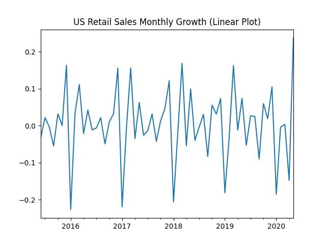
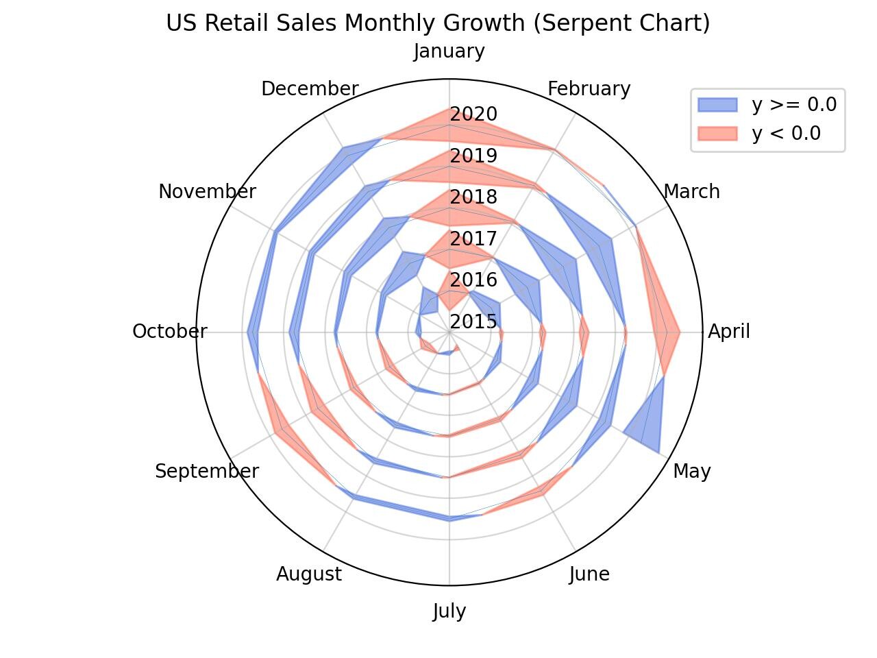
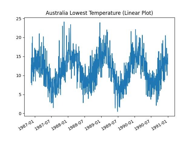
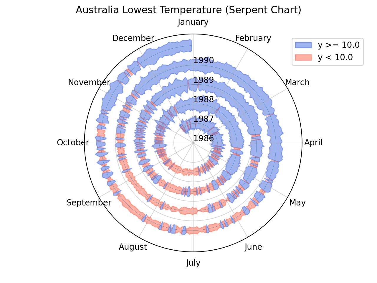
While looking through some files here I found a script that I wrote a few months ago trying to replicate that NY Times serpent chart from earlier this year (https://www.nytimes.com/2022/01/06/opinion/omicron-covid-us.html).
Plotted some time series with it to check out if they are any good. Although it's really hard to extract much information from them, turns out that the serpent chart was quite useful for detecting seasonal patterns!